The process we followed to develop our branding and how it played out, including a free creative brief template for your next branding project.
Branding 101
What is a brand? It’s how you’re represented to the world, how others see you, or perhaps more accurately: how others interpret you. It’s an opportunity to reflect your personality, and what you’re about.
A ‘brand’ can be anything from a basic logo, to a full design system, but it can be hard to know where to start if you’re building it from scratch.
Here’s the process we followed, and prompts for each stage:
Step 1: Brand strategy 🌟
Who are you, and what’s your:
- Purpose
- Mission statement
- Brand personality
- Values
- Brand voice
- Name
- Tagline
Step 2: Research 🔎
Who is your audience? Consider:
- Target audience
- Secondary audiences
- What do they care about?
- What do they want from you?
Who are your competitors? Consider:
- Who is competing for your audience’s money or attention?
- What are your competitors doing well?
- What are they doing badly?
Gather creative references. Consider:
- What inspires you?
- Any analogous references?
Reflect on what you’ve learned 🎛️
Where will your brand sit in context with your audience and competitors:
- What are the key qualities and benefits of your brand?
- How will you stand out?
- Why would someone choose you over another?
- What’s your value proposition?
- What are your unique selling propositions?
- Sharpen up your elevator pitch (who you are, and what you offer)
Step 3: Prepare a creative brief 📝
What will someone need to know when creating your brand identity:
- Where will your brand exist? Online? Offline?
- What are the key deliverables, or scope of work?
- Do you have a preference for your logo to be a type treatment, an image, or both?
- What’s your budget?
- Ideal project timing?
- Do you have a mood board?
- Provide creative references, and what you like or don’t like about them.
- What else would be useful to understand?
Step 4: Return brief ↔️
Allow for refinement of the brief in collaboration with whoever is going to be working on it:
- Who is going to be involved in the brand development?
- Does everything make sense?
- Explain where specific requirements have come from.
- What’s flexible, and what’s not?
- How will you work together? In person presentations? Over email?
- How will you communicate feedback?
Step 5: Brand development 🎨
Be realistic about how long it might take to get this right, regardless of whether you’re doing it yourself or outsourcing. Consider the desired longevity, and what might be lost if this phase is rushed, particularly if timelines or estimated cost need to change (e.g. to accommodate additional revisions or new deliverables).
On the other hand, you should have a clear idea of what is ‘enough’ for your initial needs, to understand whether new items can wait. Think about what ‘enough’ means for you:
- Enough to produce business cards?
- Enough to produce a letterhead?
- Enough to produce an invitation?
- Enough to use on an email signature?
- Enough to setup a website holding page?
Step 6: Create a style guide ✨
Your identity might include logo, colours, typography, image treatment, supporting illustrations… whatever was deemed relevant to your brand. Ideally this will all be documented in a style guide, accessible to anyone who needs to apply it.
- Who is responsible for setting up this style guide?
- Was it part of the branding identity scope of work, or will you do it yourself?
- Show examples of what to do, and what not to do.
- How does it vary for print versus online?
Step 7: Iteration and refinement 🔁
How will the style guide evolve over time?
- How will new items be added? Who can edit?
- What ideas came up during brand development that haven’t been addressed yet?
- What should take priority?
- Who will handle them?
So, how did this play out for us?
This project started its life as a passing comment in a conversation between friends, followed by the creation of a Trello board (naturally!), to help us manage the next steps as we tried to work out what a minimum viable product might look like.
We knew we were going to need design support if we were going to make a real go of it, so when we were ready we approached the best designer we knew (*cough* Jess’ boyfriend *cough*).
Look, if there’s one person we have to thank for bringing Producing Paradise into fruition (outside the power trio), it’s Aaron Puls: designer, advisor, and champion of our branding. He made us look gooood! 💅
Here’s what happened in a nutshell:
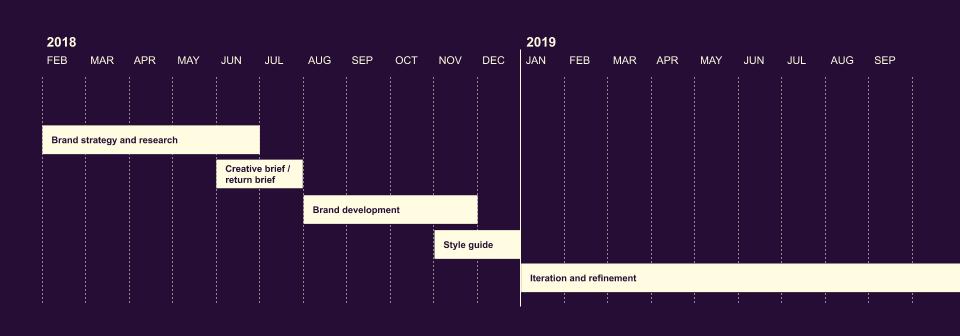
Now here’s the long version…
Step 1: Brand strategy 🌟
We used a shared Google Doc to capture our discussions and decisions as they were being made, including things like:
- Helping share our experience/expertise to help others improve theirs
- Learning from other people
- Build a community (particularly women!)
Our mission is to build an inclusive community, that empowers, inspires and promotes self-improvement for creative and digital thinkers.
Tagline: Three producers sharing what they know
Tone of voice
We identified our ‘brand personality’, noting that the personalities and individuality of Jess, Lilith and Aimee should shine through.
Font
We found a font we all loved early on called Palm Canyon Drive, “inspired by retro matchbook covers, travel postcards, Tikki bars and Hollywood”. This oozed ‘paradise’ to us, and helped us to start shaping the rest of our identity around it.
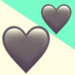
We ❤️ emoji
Peppering our conversations with emoji has been natural for all three of us for many years now (thanks, Slack), so we had a hunch it would form part of our brand identity.
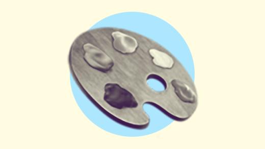
In early conversations with Aaron, we toyed with the idea of a palm tree cycling through all of its emoji variants for different platforms, as a nod to our ambition for inclusivity. He helped whip up this mockup:
Step 2: Research 🔎
We used the same shared Google Doc* to identify our audience, competitors, references, and inspiration, along with any new ideas and questions that were coming up as a result of that process.
*We’re still using this today! It’s now 40 pages long and has become something of an encyclopedia.
Step 3: Prepare a creative brief 📝
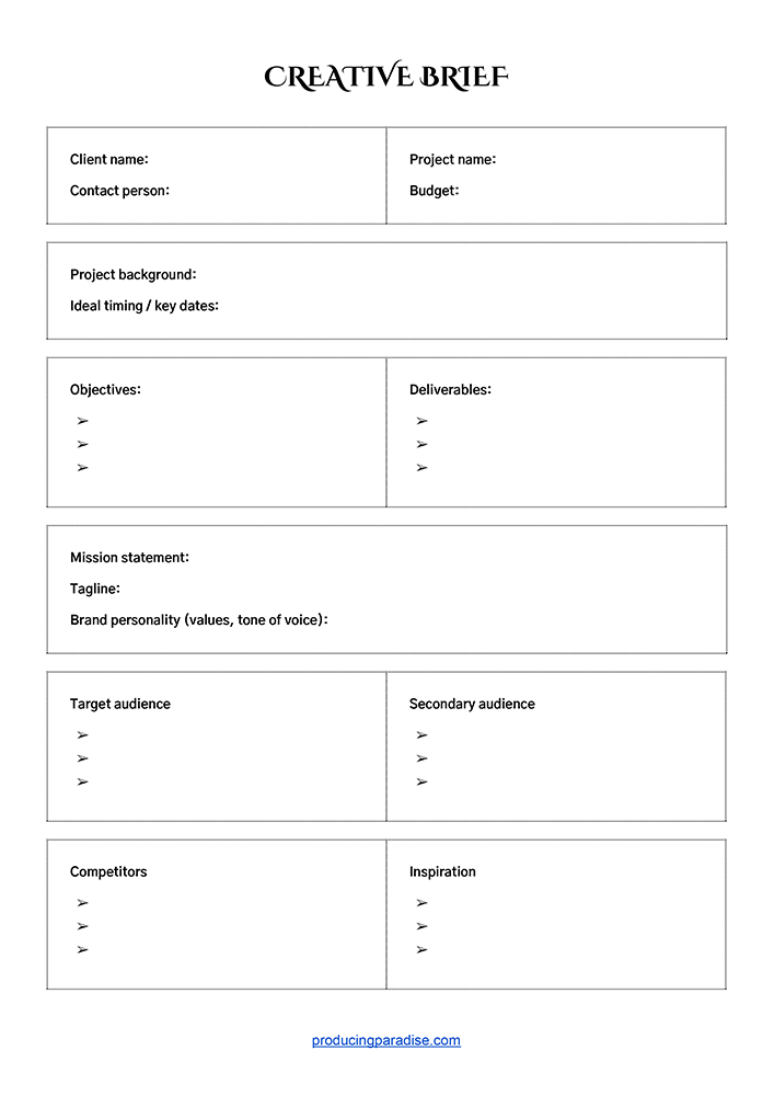
We decided to formally enlist Aaron’s help at this point and prepared a creative brief* including:
- Client name
- Contact person
- Project name
- Budget
- Project background
- Ideal timing / key dates
- Budget
- Objectives
- Deliverables
- Mission statement
- Tagline
- Brand personality (values, tone of voice)
- Target / secondary audience
- Competitors
- Inspiration
*We’ve included a handy template for this at the end of the post!
Step 4: Return brief ↔️
We talked the brief through with Aaron and reiterated that we were pretty flexible on what the first round should include, and confirmed the final list of deliverables:
- Main logo
- Secondary logo (favicon)
- Colour palette
- Webfont selection
- Style guide (for all of the above, plus basic mockups in situ)
Step 5: Brand development 🎨
Initial concept
Our first look at the branding was a series of three website header mock-ups, as a means to both see the initial logo concept and get a sense of how it could work in situ on the website.
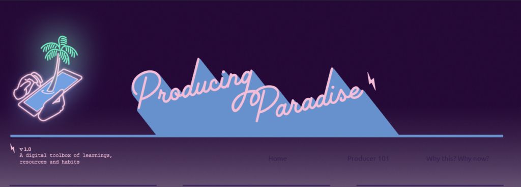
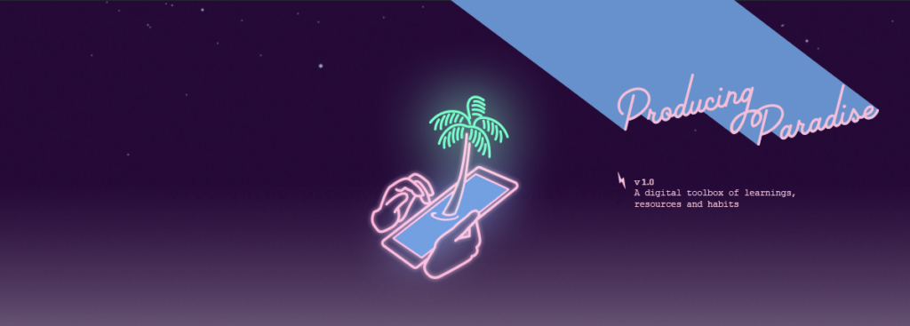
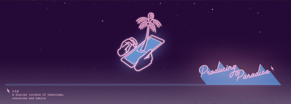
Feedback
We discussed the concepts and consolidated our feedback for Aaron into a single page.
I love this look. I think it’s fun and fresh. Thank you Aaron!
Lil
Aaron smashes it out of the ballpark
This is what came back after that first round of feedback, and honestly, we were left speechless (in the best way!).
I literally have no other feedback beyond: I ABSOLUTELY LOVE IT.
Aimee
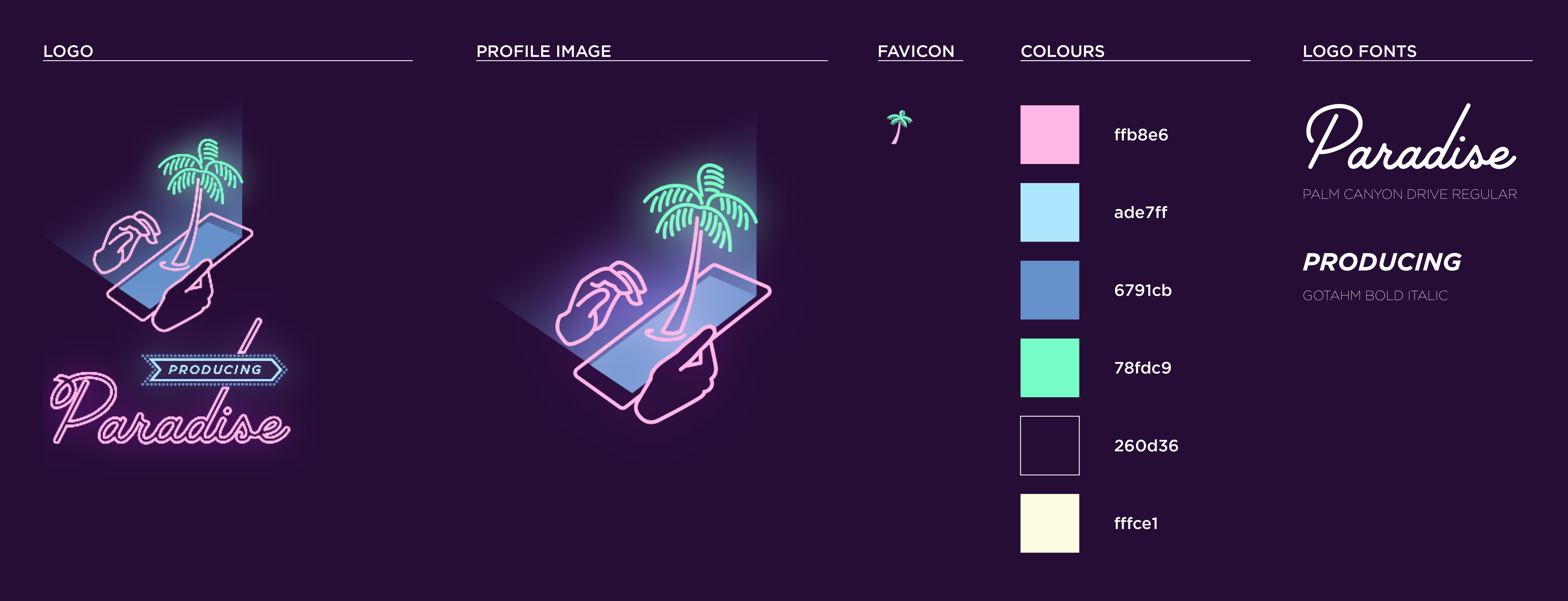
Step 6: Create a style guide ✨
An early version of our style guide included the logo, favicon, colour palette, and logo fonts.
Step 7: Iteration and refinement 🔁
Logo refinement
Aaron refined the logo so the word ‘producing’ would be more prominent, and for the elements to be better integrated and talking to each other (rather than the previous stacking).
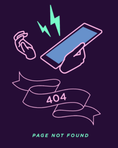
404 image
We wanted a cute 404 image as a bonus for anyone who came across a broken link on our site.
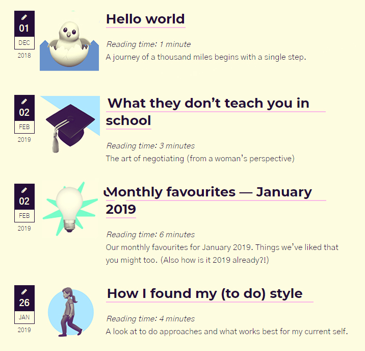
Featured images
We knew each post needed a featured image to break up all the text, and again Aaron nailed it on the first go.
I have been playing with some image treatments for the featured images, see attached. I worked through a few options to land on this one. Originally I duotoned the emojis (yellow and purple). This gave a really slick effect, and gave the brand ‘ownership’ over them. The only issue was the page need a bit more colour splashed around to suit the branding. So I added the background shapes in assorted brand colours. The result is quirky and energetic.
Aaron
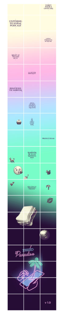
Instagram profile
We hadn’t considered giving our social media accounts any sort of special treatment, so it was a real bonus when Aaron came back with our Instagram profile concept. This became one of our favourite outcomes of the whole branding process!
The only change we made was to remove ‘blank tiles’ so that each Instagram post could relate to a specific blog post (or other item).
I THINK THIS IS THE GREATEST and also you are the greatest.
Jess
What’s next? 🔭
We’ve come a long way, baby. Since deciding to start this adventure on 9 February 2018, this project has been an invaluable learning process, and something we hope to continually evolve and improve.
We have some exciting ideas for the future, but would love to hear what you think so far! Drop us a line, or leave a comment on this post 📧
Resources 📚
Creative brief template
We turned our creative brief into a free template in case you want to use it yourself — either make a copy of the Google Doc, or download the PDF 💁
Example style guides
For inspiration, see:
- MailChimp’s brand assets
- Atlassian’s end-to-end design language
- Pinterest’s Brand Guidelines
- Dropbox’s brand materials
- Instagram’s Brand Resources
- Facebook’s Brand Resource Centre
- Twitter’s Brand Resources
- TEDx’s Design System
- Google’s Design Resources
- And one of the best: NASA’s Graphic Standards Manual (PDF), from 1976!