
How to make your website more accessible

We learned a lot about accessibility while researching this article. Hopefully it helps you too.
Summary: Improving website accessibility benefits all users and boosts engagement, SEO, and usability. Inspired by Better Allies, we audited Producing Paradise and made changes like adjusting heading levels, refining alt text, and avoiding justified text. Key takeaways: run accessibility tests (WAVE, Lighthouse, WebAIM), use clear navigation, write alt text properly, avoid emoji bullet points, and ensure keyboard/mobile compatibility.
Each week Karen Catlin shares 5 simple actions to create a more inclusive workplace in the Better Allies newsletter, and I always learn something useful. In the latest issue, one action was to create more accessible communications, and for us it was a kick up the butt to do something of an 'accessibility audit' on this website.
“Even if we aren’t in a formal design role, we can leverage accessible design best practices to communicate effectively and inclusively with our coworkers. Think reports, shared documents, presentations, emails, and posts on Slack and other discussion boards.”
Why website accessibility matters
Website accessibility helps everyone. What makes your site easier for someone with visual impairments or cognitive disabilities to use will make it easier for everyone else too. Small tweaks can genuinely improve how people interact with your site, and as a bonus, many accessibility improvements help with SEO and engagement.
Putting it into practice
I sifted through past issues of Better Allies to gather the most relevant accessibility improvements we could apply here, and will list them below so you can do the same.
Start with an accessibility audit
WAVE test
Google Lighthouse test
WebAIM contrast test
Make your content accessible
Use clear and readable text
Make navigation simple and logical
Ensure your website works with screen readers
Make your site keyboard and mobile friendly
Consider users with different cognitive and visual needs
Practice respectful emoji use
Don’t use emoji for bullet points
Interrogate your emoji colour choices (yellow emoji are not neutral)
Write good alt text (when it’s needed)
If you'd rather watch the video runthrough (5min), it's over here:
1. Start with an accessibility audit
WAVE test
The WAVE Web Accessibility Evaluation is a free tool designed to helps authors make their web content more accessible to individuals with disabilities — you can run a quick test, then use the refresh button as you work through publishing the changes, to make sure they've done the trick ✅
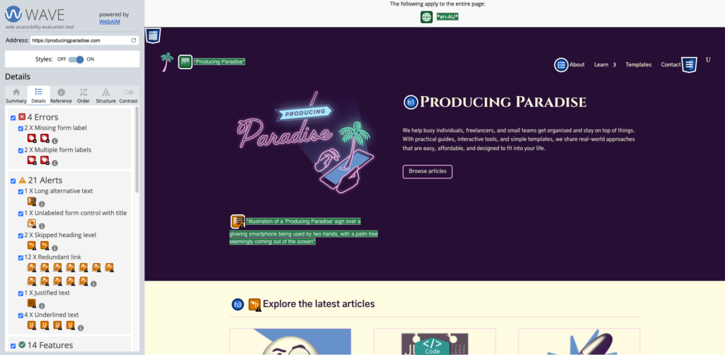
I put our current home page link in and found a slew of improvement items for us to work through 😬
Some changes we made to the home page off the back of this test were:
Don’t use ‘justified’ text — footer acknowledgement of country changed to centered text
Check for skipped heading levels — “Explore the latest articles” changed from H3 to H2
Use short alt text — logo alt text reduced to “Producing Paradise logo showing a smartphone with a palm tree coming out of it”
Google Lighthouse test
You can also run your site through the Google Lighthouse tool (I used the browser version), which tests performance, accessibility, best practices and SEO.
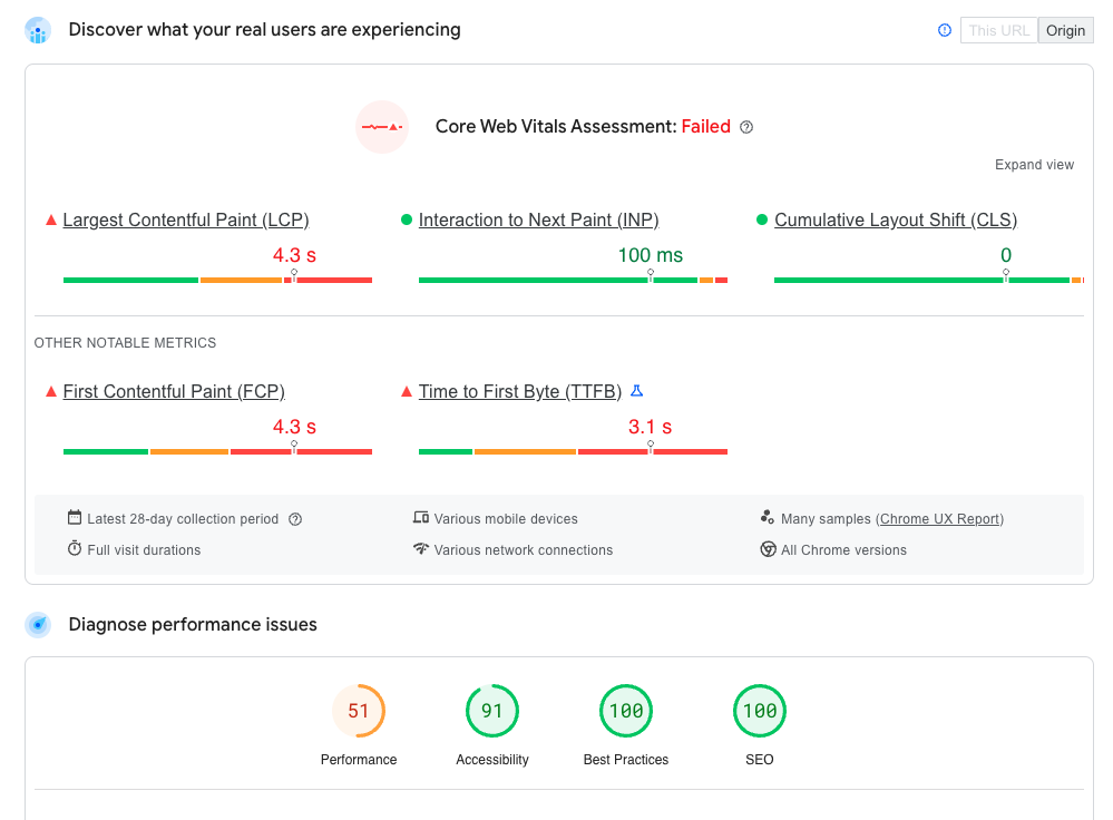
Looks like the site performance (ie. page load speed) is the focus area for us 🐌
WebAIM contrast test
Lastly, it's worth putting your website's text and background colours into the WebAIM contrast checker.
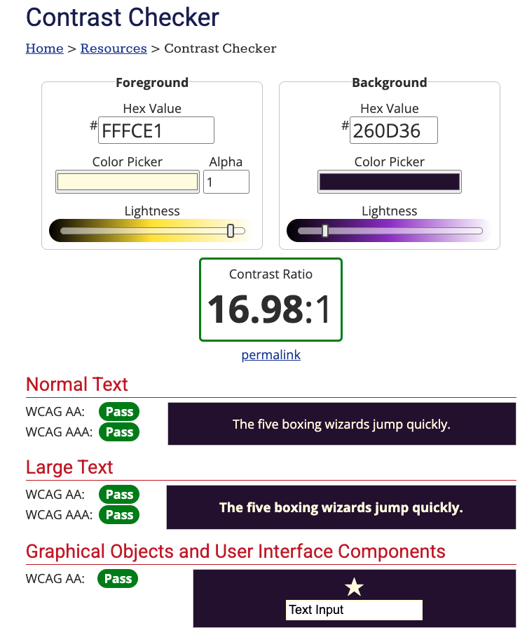
Luckily we did okay on contrast...
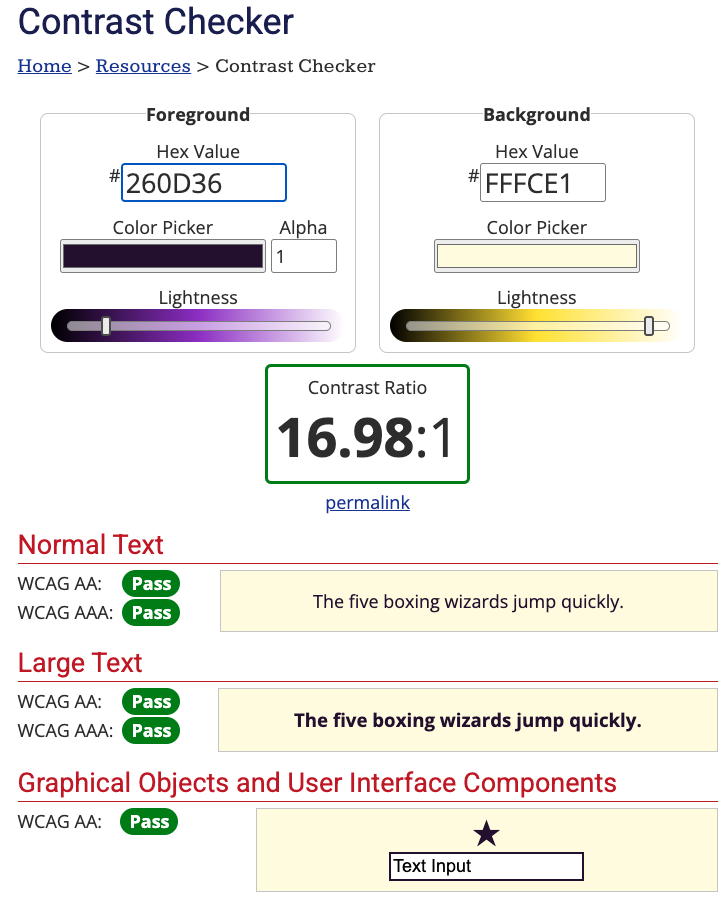
...for both colour combos 💛💜
2. Make your content accessible
The UK Government has produced some excellent posters with the "Dos and don'ts on designing for accessibility". It currently cater to users from these areas: low vision, D/deaf and hard of hearing, dyslexia, motor disabilities, users on the autistic spectrum and users of screen readers.
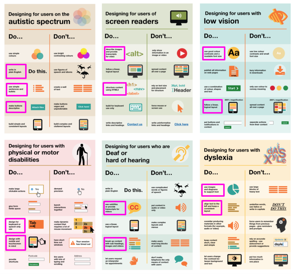
I highlighted some of the stand-out items for us to check or remember when writing articles for this site
Use clear and readable text
Don't:
Use large blocks of unbroken text
Rely on fancy fonts or all caps for emphasis
Use only colour to convey meaning (eg. red for errors without text labels)
Use large chunks of italic text*
*This was a real a-ha moment for me, learning that many respected and trusted accessibility resources advise against the use of blocks of italic text
Do:
Choose simple, readable fonts (sans-serif like Arial, Roboto, or Open Sans)
Maintain high colour contrast between text and background
Keep sentences and paragraphs short for better readability
Make navigation simple and logical
Don't:
Overcomplicate navigation with excessive dropdowns or hidden menus
Use vague link text like "Click here" instead of "View our pricing guide"
Do:
Use clear headings and subheadings (H1, H2, H3 structure)
Ensure menus and links are easy to understand and use
Add a site search function for accessibility and convenience
Ensure your website works with screen readers
Don't:
Only convey important information through images or videos
Use vague headings like "Read more" instead of specific descriptions
Do:
Use descriptive alt text for all images
Make all interactive elements (buttons, forms) keyboard-friendly with clear labels
Provide captions and transcripts for video/audio content
Make your site keyboard and mobile friendly
Don't:
Rely on hover effects alone for essential interactions
Use small, tightly packed buttons that are hard to click
Do:
Ensure users can navigate using just a keyboard (tab-friendly layout)
Design buttons and links to be large and easy to tap on mobile devices
Use responsive design to ensure accessibility across all screen sizes
Consider users with different cognitive and visual needs
Don't:
Overload pages with excessive information—break content into digestible sections
Use only colour to differentiate elements (eg. add text labels to coloured buttons)
Do:
Offer dark mode or high-contrast options
Let users adjust font sizes easily
Use plain, direct language—avoid jargon or unnecessary figures of speech
3. Practice respectful emoji use
Don't use emoji for bullet points
As an avid emoji user, I have my work cut out for me here! I'll need to go back and fix up the instances of emoji-as-bullet points on this site, either replacing with regular ol' bullets or just removing them entirely.
So that's:
Good!
Good!
😬 Bad
👎 Bad
“Can we all agree to stop using emojis as bullet points. I beg. They’re a nightmare for screen reader users. Not only is hearing the description of each emoji being read out before every sentence annoying, it’s also quite distracting. Just add line breaks between each point or use dashes for bullet points instead.”
Interrogate your emoji colour choices (yellow emoji are not neutral)
A 2021 study by the University of Edinburgh found that "text messages and social media posts that contain yellow emojis are seen as having been written by White people". This isn't necessarily a bad thing: if you are a White person using yellow emoji to represent your own experience, then it might make sense, but the lesson here is that they don't represent neutrality 🙋♀️🙋🏻♀️🙋🏼♀️🙋🏽♀️🙋🏾♀️🙋🏿♀️
Is it OK to use black emojis and gifs? - BBC News
A 2017 BBC News video (1m22s) proposes that when White people use Black emoji it's a form of cultural appropriation. To avoid "digital blackface" the video encourages you to ask yourself why you're drawn to the Black emoji, to interrogate if it's respectful use or not.
4. Write good alt text (when it's needed)
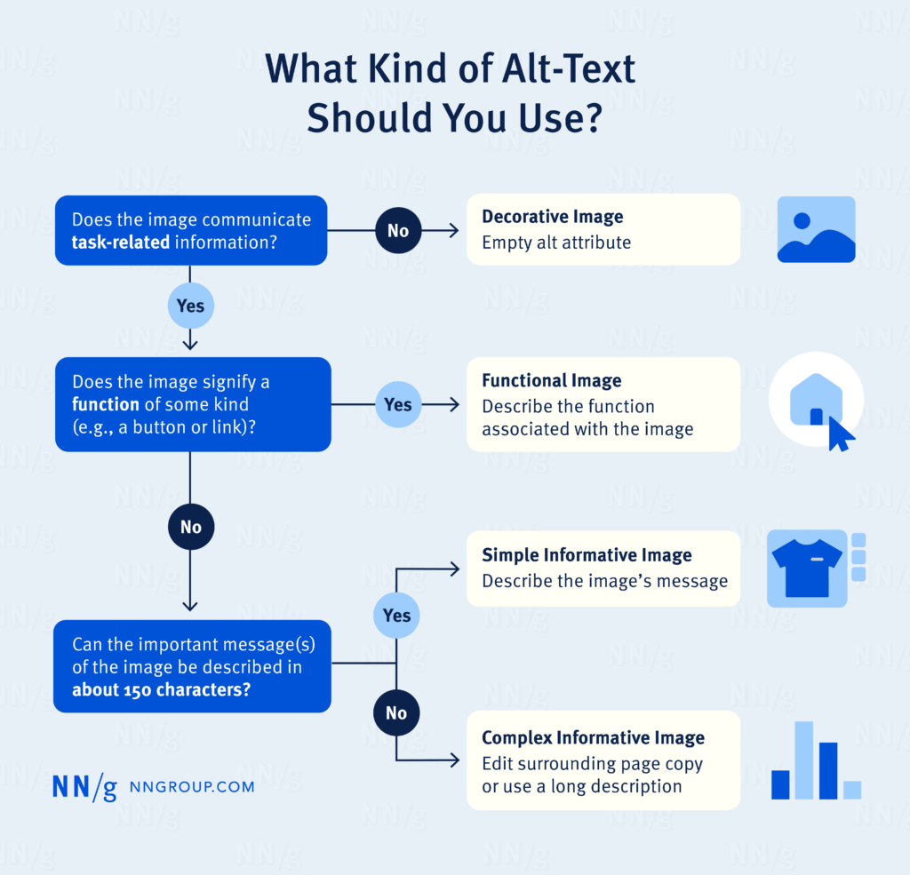
The Nielsen Norman Group have some great advice about when and how to write alternative (alt) text for your images:
Keep it short
Don't include words like 'image' or 'photo'
End alt text with a period
Frontload with the most important words
Always include an alt attribute, even if it will be empty
Avoid technical jargon and abbreviations
Never reuse alt text for the same image without reanalyzing the context
Only mention identity if it's relevant
Include alt text in each language that your page supports
Properly written alt text can help with image SEO too ✔️
Next steps: get implementing
Improving accessibility doesn’t have to be overwhelming: start with small updates, such as checking your colour contrast and ensuring proper heading structure. You can work through little improvements over time.
By making your site more inclusive, you’re not just helping users with disabilities—you’re improving usability for everyone. Prioritising accessibility means more engagement, better SEO rankings, and a positive experience for all visitors 🫶
Made your website more accessible? Now organise the rest of your processes
Accessibility is just one system in your business that needs attention. The rest of your workflows deserve the same care.
Want a streamlined system to support your customer experience goals?
The Organised Creative Notion Template helps you track projects, manage tasks, and keep your business organised so nothing falls through the cracks.
EXPLORE THE TEMPLATE →
Ready for the complete framework?
The Most Organised Person I Know shows you how to design simple systems that reduce mental load and help your work flow more smoothly, from daily tasks through to long-term projects.
GET THE EBOOK →
Because accessibility isn't the only thing that deserves a proper system.